Reviving the Glory.
Clearing the clutter and sharpening the good stuff, to future proof a cult beauty brand for global expansion.
+ Read moreSoap & Glory burst onto the beauty scene over a decade ago; with its witty tone of voice and distinct look & feel, it was delightfully different from anything else and quickly attracted an army of fans.
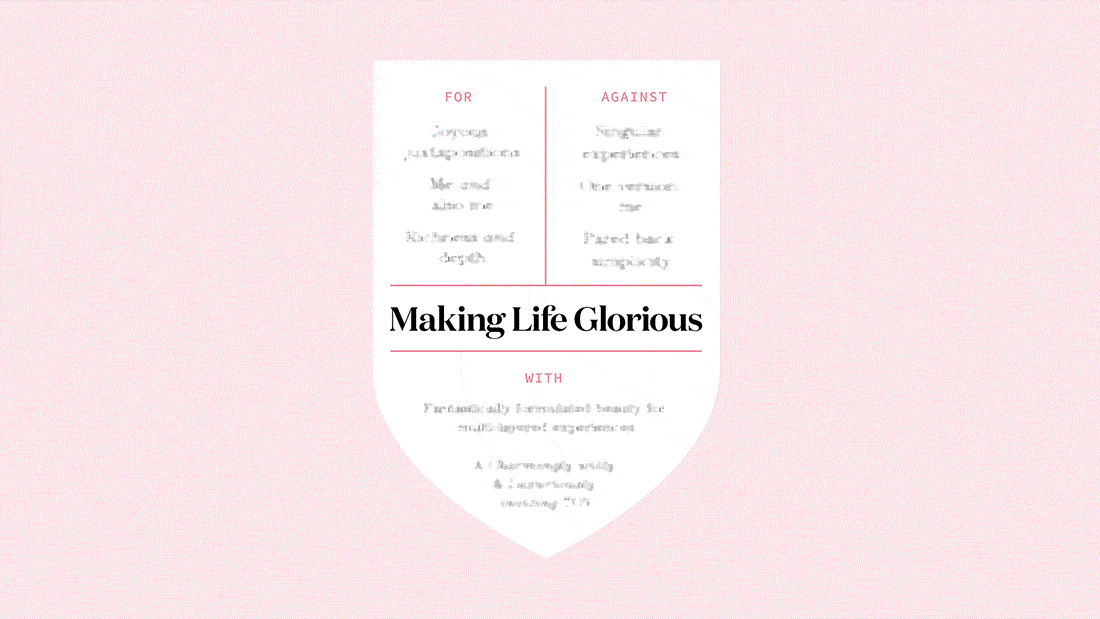
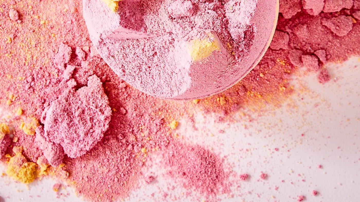
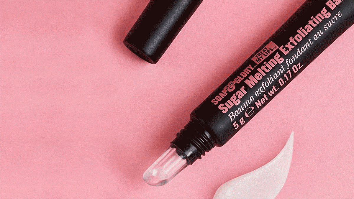
But over time it became inconsistent in its eclecticism, as it developed more products and expanded into new markets. With the help of brand archetypes, we revisited the brand’s fundamentals to clarify who it was and what it stood for. While minimal beauty brands were in vogue, Soap & Glory, as the name suggests, had always believed in juxtaposing this and that for a more joyful experience. Looking to our audience, we saw that they too were dabblers and concocters, with a pick ‘n mix approach to life. With the audience energy in mind, we thought that where there is less, we’ll add more and where there is ordinary, we’ll add something extra – and this lead us to our brand platform: Making Life Glorious.
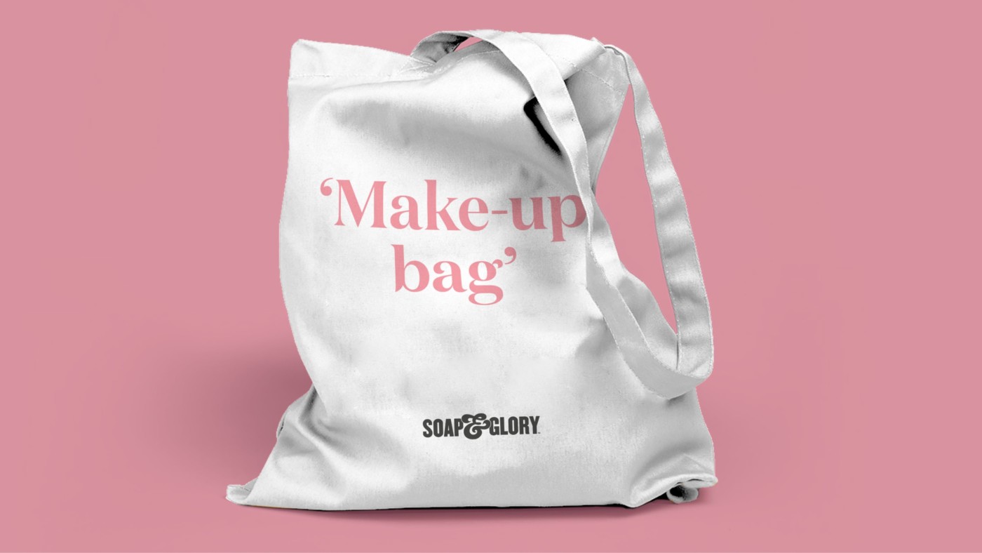
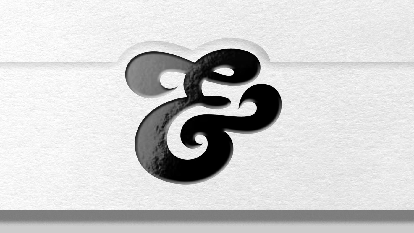
Our brand identity started with releasing their name, that carried so much recognition, from the restriction of a roundel and reverted to an enhanced earlier linear iteration of the logo. Big, bold, glorious, confident and top of the pecking order. This became the blueprint to recapturing the distinctive qualities of the brand.
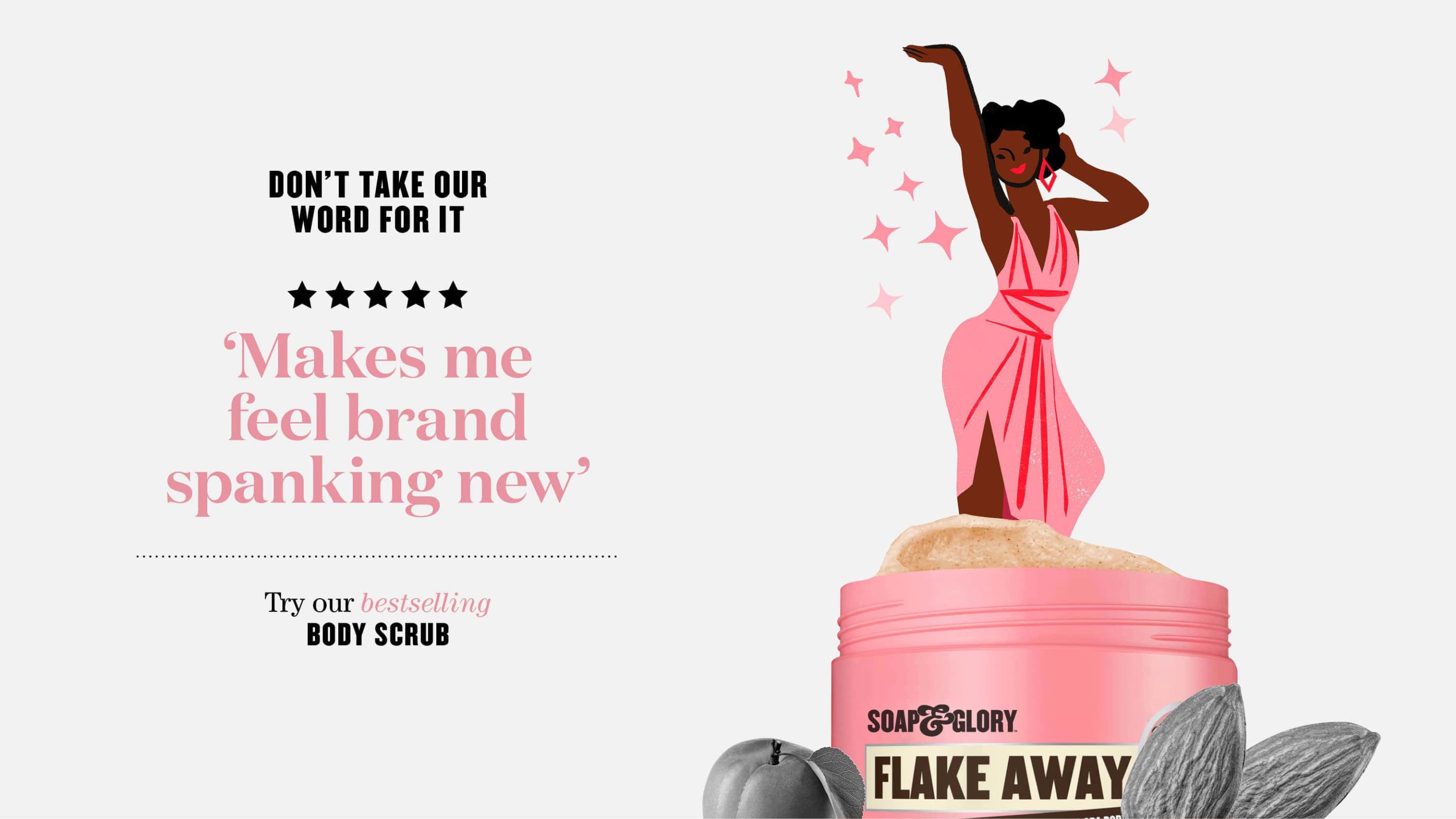
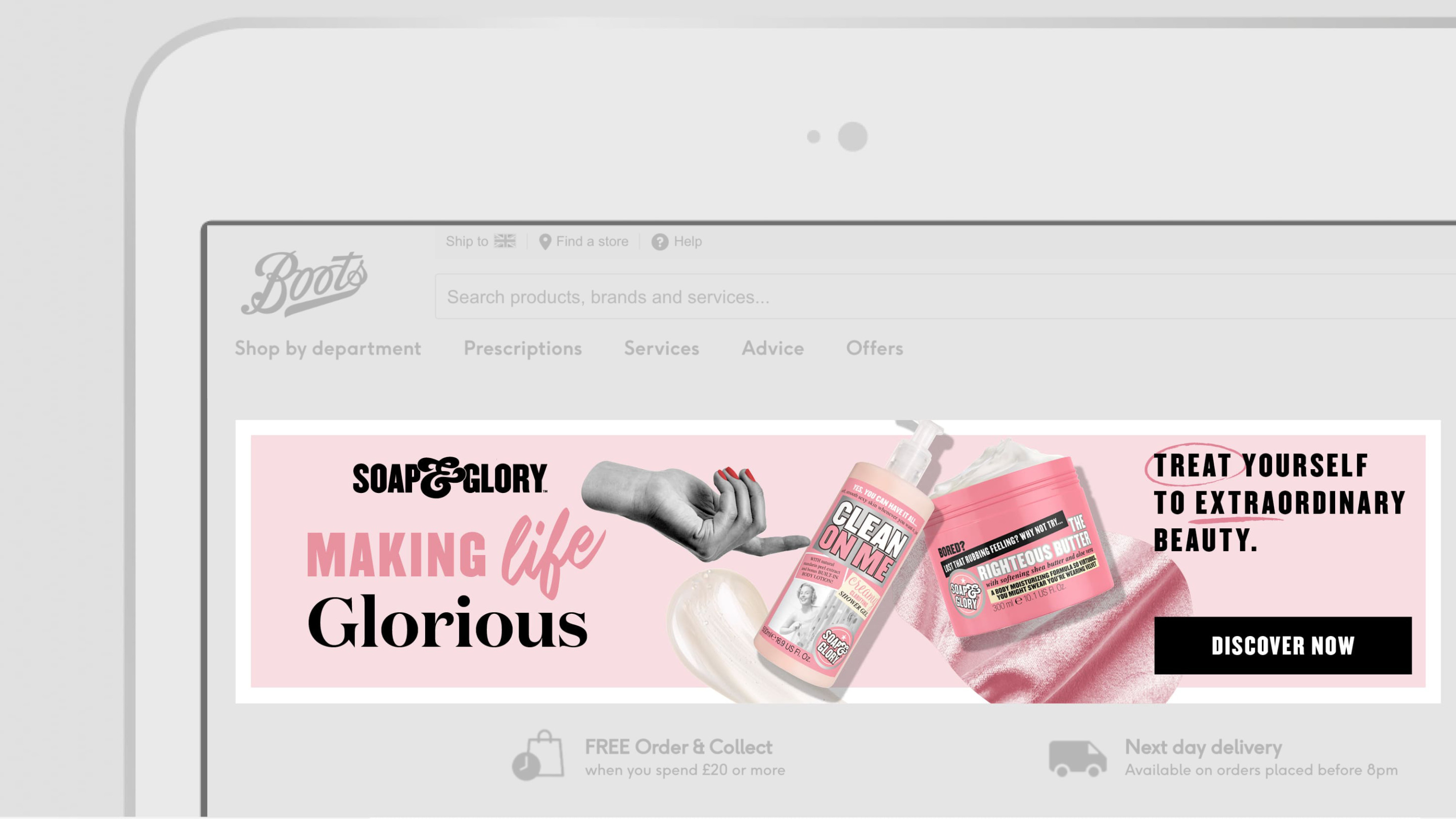
Where previous communications were described as ‘tabloid’ in layout – we elevated this to ‘Editorial’. Because S&G are ‘cultural mixologists’ – we were naturally dealing with lots of information. Editorial design works in a similar way – dealing with lots of content and content types, enabling vast flexibility, in a visually inviting way. This helped reframe all brand communications from Social media through to POS, with greater control of hierarchy, clarity and articulation.
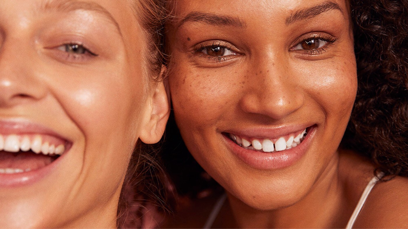
A sticking point had been the renowned use of archival monotone imagery that due to the era didn’t capture the diversity of the modern world.
We addressed this in two ways.
The ‘vintage ladies’ would make way for specially commissioned illustration, which encapsulates a feel-good, fun, carefree tone with a joyously juxtaposed vintage vibe – all without the baggage or using imagery actually from a different era.
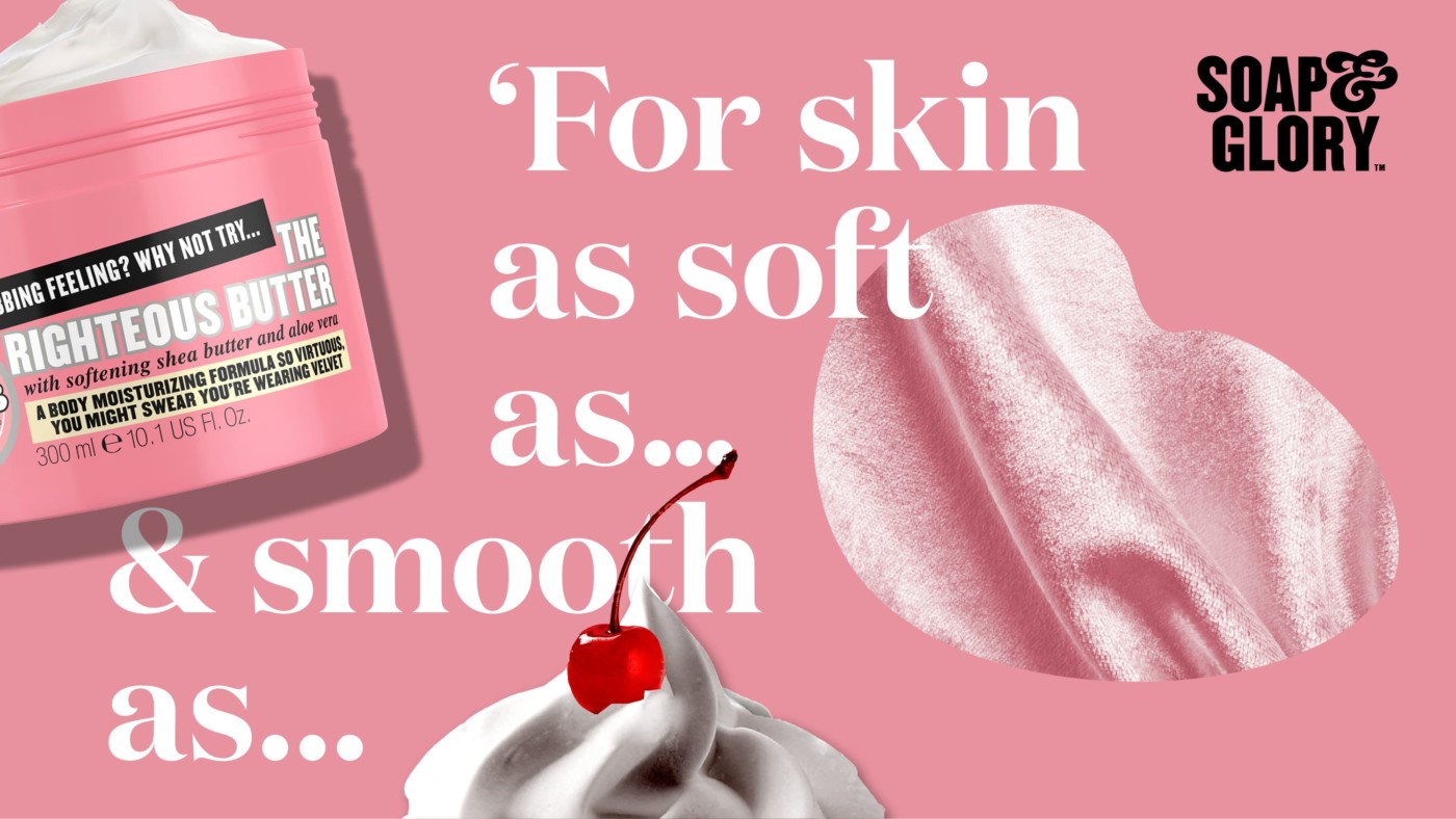
Secondly, we would use monotone imagery (such a useful ‘shorthand’ for brand recognition) but more abstractly. So if our body butter is a soft as a Pomeranian – we use a cutout monotone image of a Pomeranian.
Case study
Share
LOOKING FOR THE RIGHT COMBINATION OF SPECIALIST THINKING FOr YOUR PARTICULAR PROBLEM?
For general enquiries
For accounts
Follow
